Project Reveal | River Road Remodel
In honor of Inspired Home Magazines Summer issue featuring our River Road Remodel, we’re sharing some of our favorite spaces. This remodel was taken down completely to the studs and each detail was put back into place with carefully thought out design.
For a busy family, the main goal of this space was durability and function. We utilized these outdoor grade counter stools at the island to bring in just a slight contrast and texture against the white washed oak island. The perimeter cabinetry was painted in Benjamin Moores Edgecomb Grey for a classic and timeless feel against the Benjamin Moore Decorators White walls. To stick with the timeless but updated feel, we incorporated a square zellige tile to compliment the Cambria Brittanica quartz tops.
We worked closely with the project contractors of Samson Construction to bring in new but classic feeling millwork through out the main level. We complimented the white brick painted fireplace with a custom wood mantle, beams & tongue and groove paneling on the ceiling. The white washed oak island finish was tied in behind the open shelving flanking each side of the fireplace. We also incorporated a board & batten detail in the foyer. We wanted to keep the furnishings beautiful, but casual in the formal foyer area so they were welcoming for all guest.
When it came to the furnishings, we utilized performance upholstery & played up the patterns to make the spaces feel warm and inviting. We also utilized a super durable low pile wool rug for easy clean up and maintenance.
One of our favorite tricks of the trade? Utilizing a Samson Frame TV above the fireplace to camouflage as artwork. The TV quality and sound is husband approved & creates a more inviting atmosphere.
We kept the pattern play going with the tile in the main floor laundry room, and tied in the Benjamin Moore Edgecomb Grey paint from the kitchen perimeter. We also opted for a brass finish on the hardware to create some contrast.
The office ties in with the rest of the home, but with a slightly more masculine feel. The homeowner wanted to make sure that this space was both functional and aesthetically pleasing as it’s right off the main foyer. We opted for a combination of open and closed cabinetry painted in Benjamin Moore Kendall Charcoal, mixed wood tones, and a subtle pop of leather. The wood tops are white washed oak, tying in with the rest of the home. For styling the shelves, we mixed in the homeowners existing items with new.
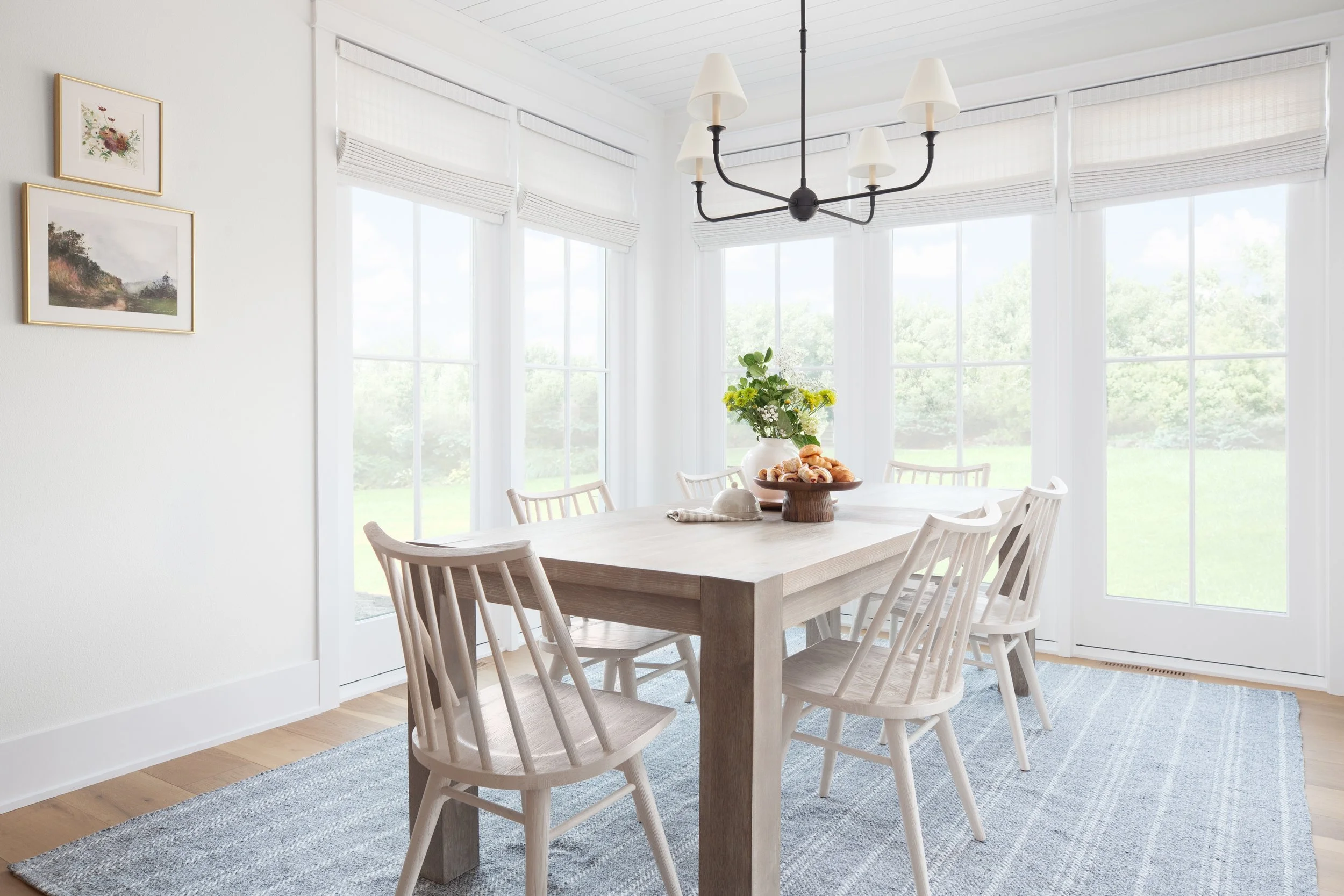
We kept the dining room furnishings light and bright to compliment the gorgeous windows that pour the natural light in. A white washed oak dining table is complimented by white painted (easily wipeable) dining chairs. An outdoor grade area rug grounds the space.
The butler’s pantry is truly the heart of this home. The finishes compliment the kitchen but also have a more casual and unique feel, making this space stand out on its own.
This home was a true labor of love between the architect, builder, homeowners and our design team. The results were truly stunning and we can’t wait to share more details in parts 2 and 3 of our reveal! See all the spaces (and some jaw dropping before/afters) in the Summer issue of Inspired Home Magazine.


